Project Overview
This is the story of how I re-designed WhatsApp to give users control over what information they are exposed to and minimize misinformation spread.
Background
WhatsApp is a messaging service which recently has been tied to the mass spreading of misinformation regarding COVID19.
Problem
Users are more likely to spread novel and negative news than factual news and this cycles into fake news spread.
Goals
○ Enable user to fact-check
○ Increase transparency between platform and user
○ Cue user to reflect before sharing
My Role
I analyzed the app to understand the habituation of current users. I conducted a basic task analysis to gain more context and then wireframed a re-design of a validation feature. I made a mid-fidelity wireframe and then created the prototype in XD. I conducted usability tests to validate my results.
Tools
Adobe XD, Balsamiq, Google Surveys, A/B Testing
Time-line
April 2020
Results
Critical Analysis time increased 30%
Impulsive forwarding decreased by 15%
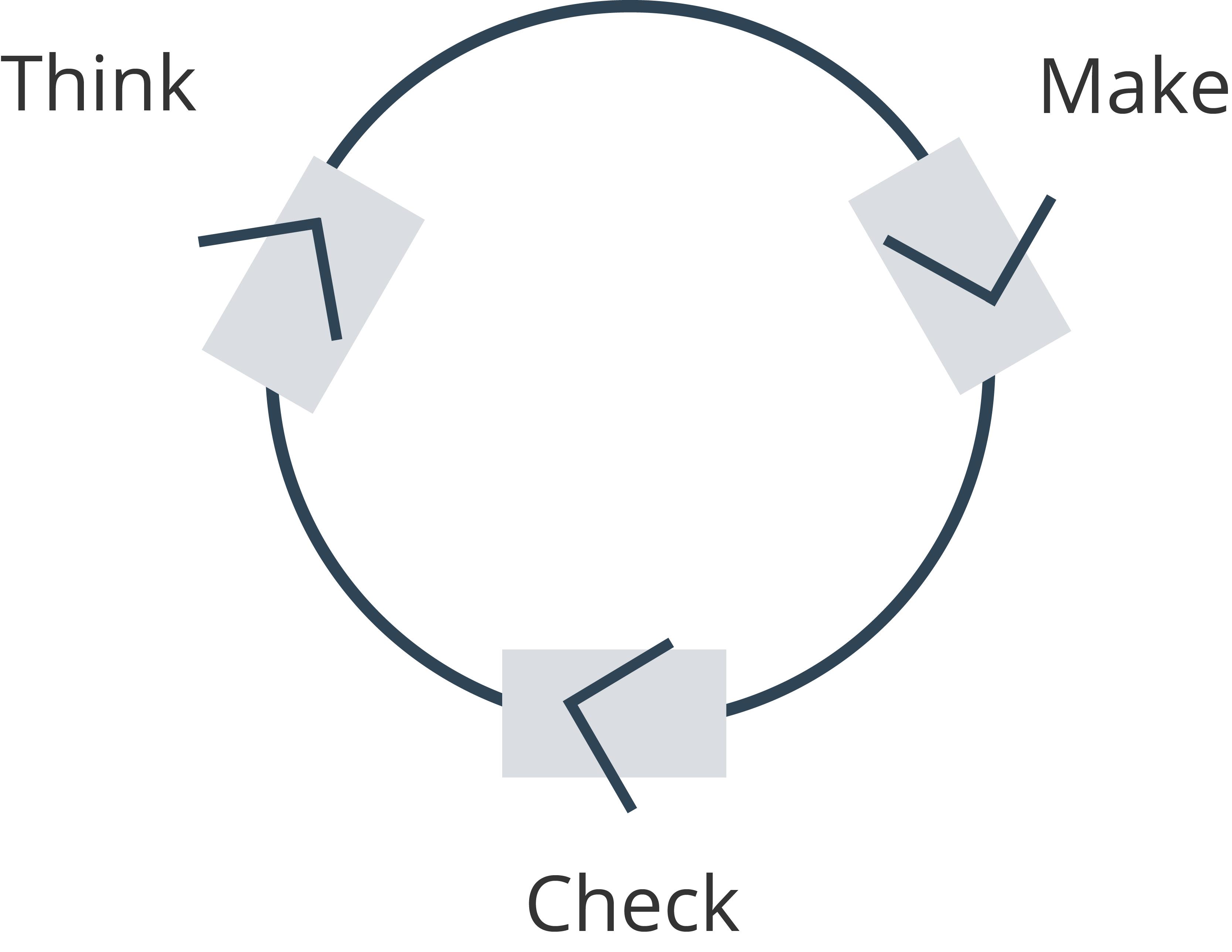
Lean UX Framework
Problem
Symptoms versus Cause
When the pandemic picked up in the United States in April, there was a spike in the mistrust of our systems. There was a question of if the CDC was reliable because of their information changing rapidly and this triggered all types of news to gain traction.
My first question was why do people spread news without checking it?
The answer breaks down into two parts:
People would rather trigger an intense emotion over a subtle one
Source mointering bias
The spread of fake news can be interpreted as malicious, but I am applying Hanlon's Razor as a mental model. Rather there are ways to redirect these tendencies with subtle cues.
Introductory Google Survey
.png)
.png)
I crafted questions which are not leading and reduce participant bias to get some foundational statistics about news consumption.
Task Analysis Study
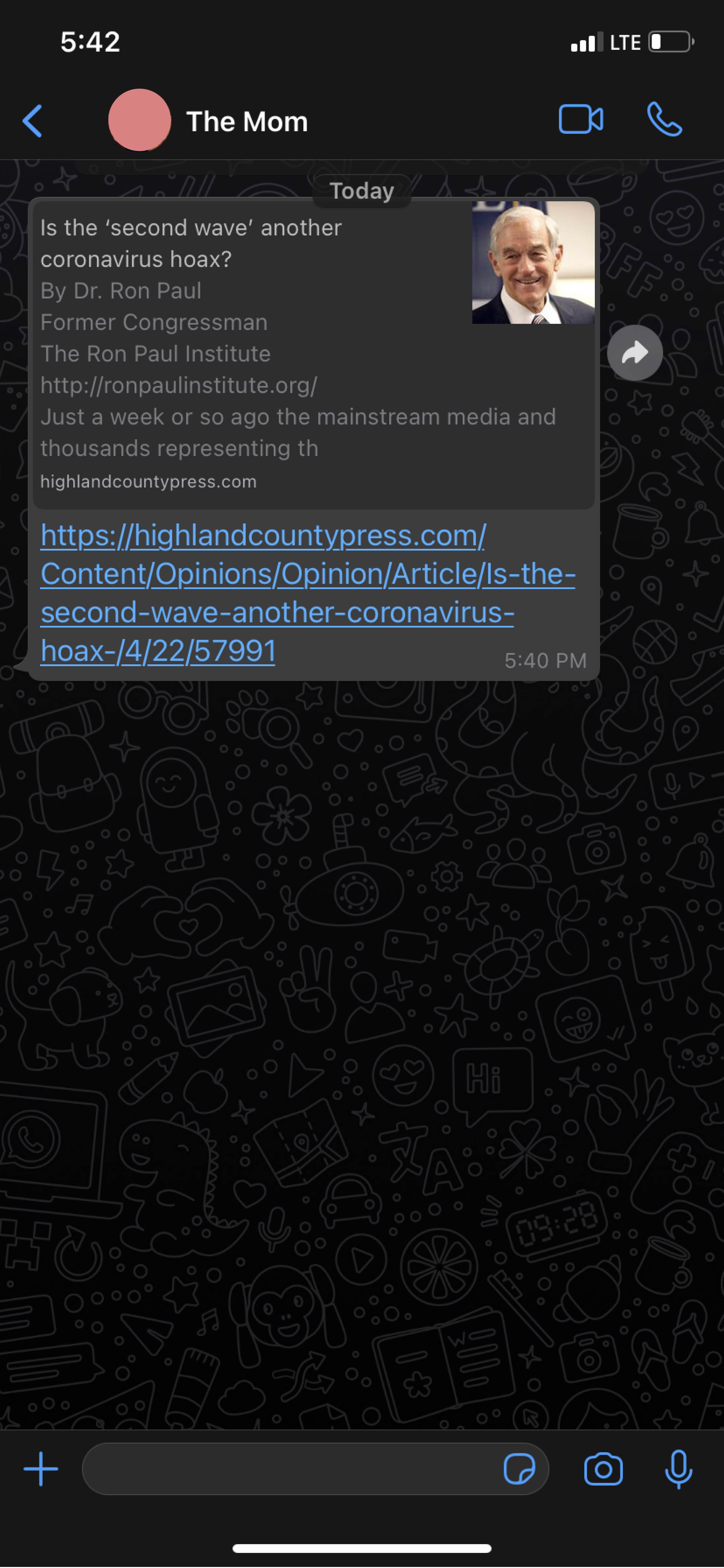
I utilized guerilla testing by asking participants in a UX Reddit group to partake in a Task Analysis Study over Zoom. I had 12 people analyze 2 articles. Participants were shown a header and 20 word summary of 1 negative news article and 1 creditability-verified article and were given the chance to forward, click the header, or ignore it.
The results were skewed with response bias but it still broke down into majority of participants quickly forwarding the alarming news. On average people took less than 10 seconds to decide to forward the link based only on the header and small summary.
Original WhatsApp Forward Feature
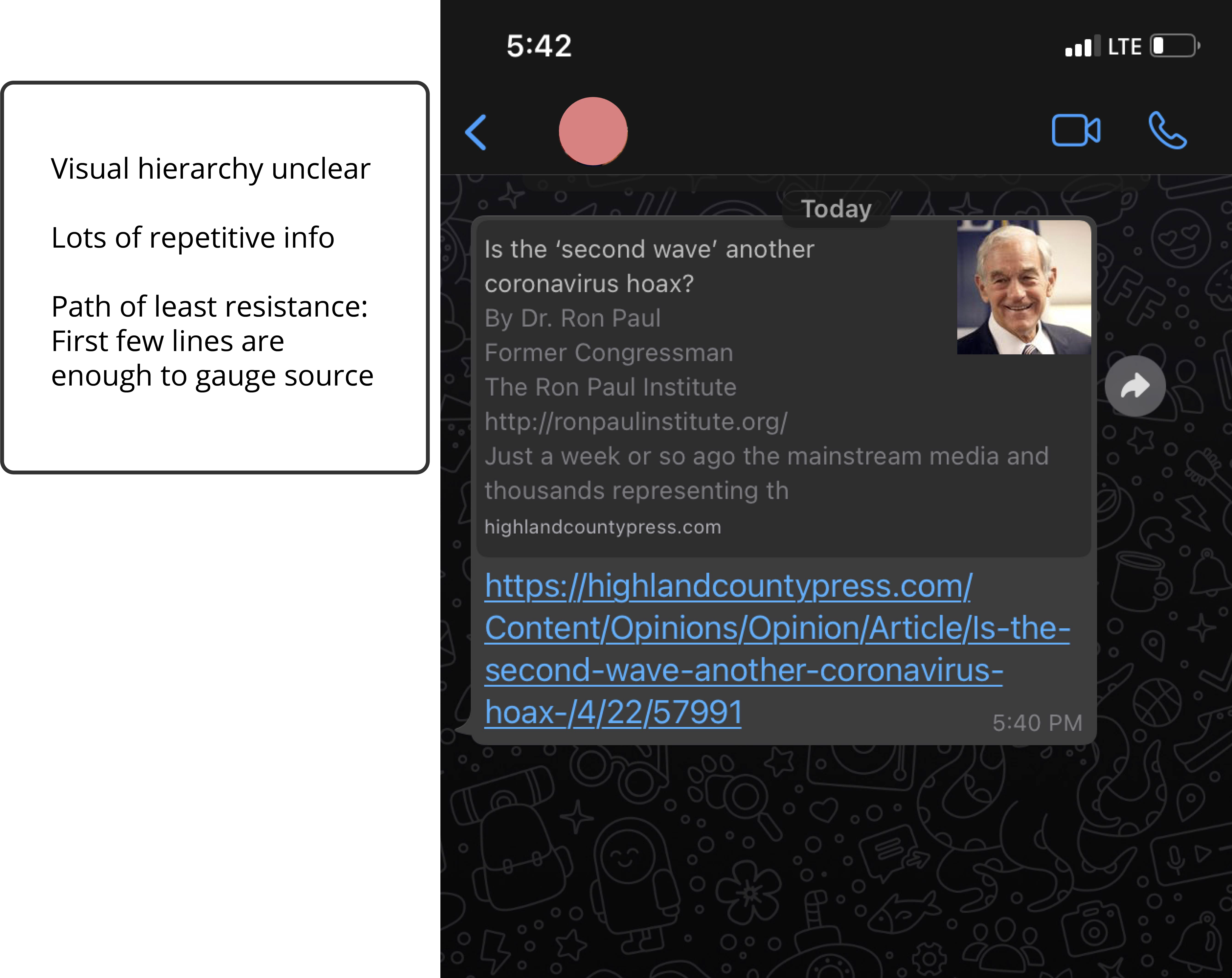
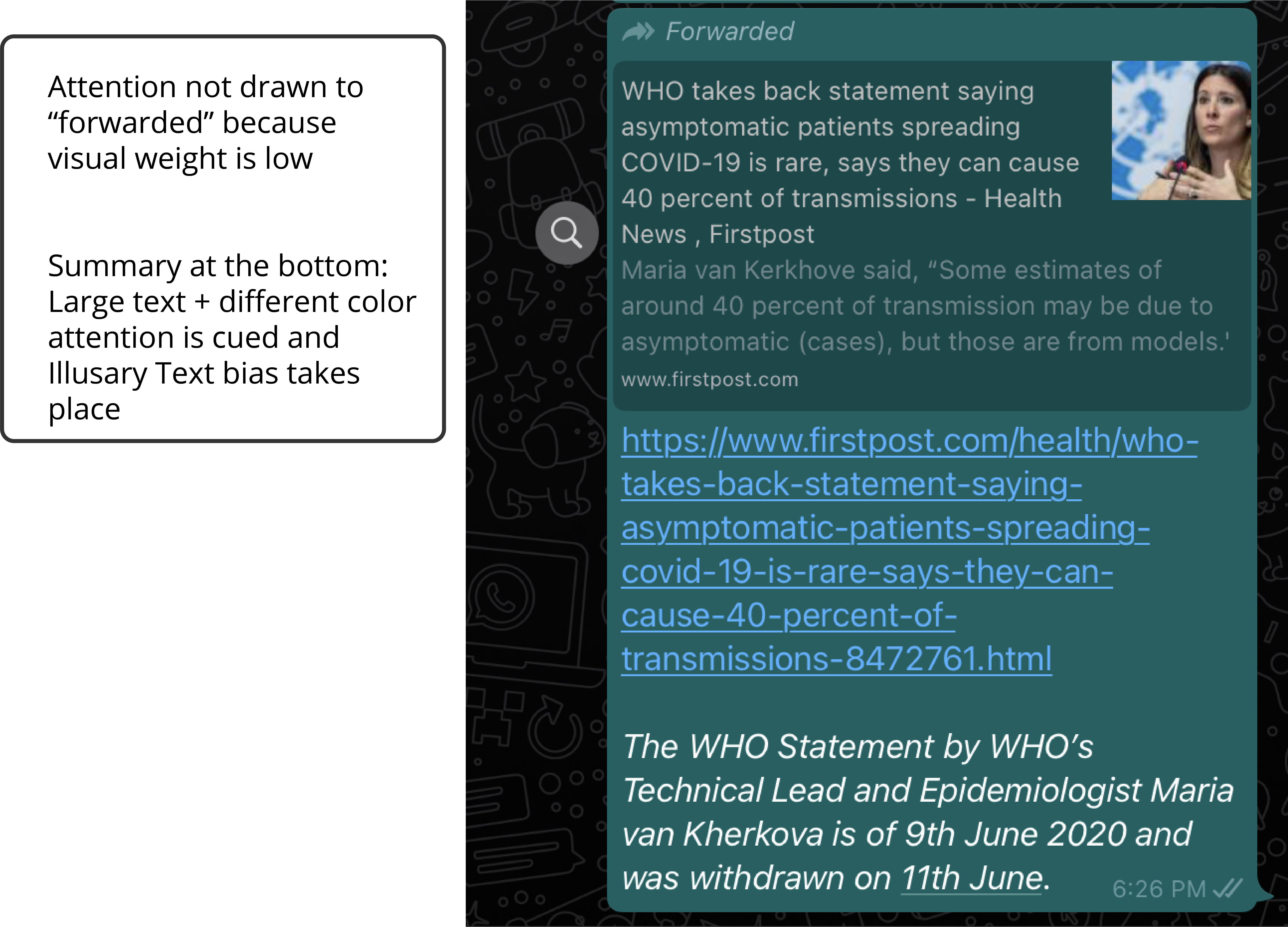
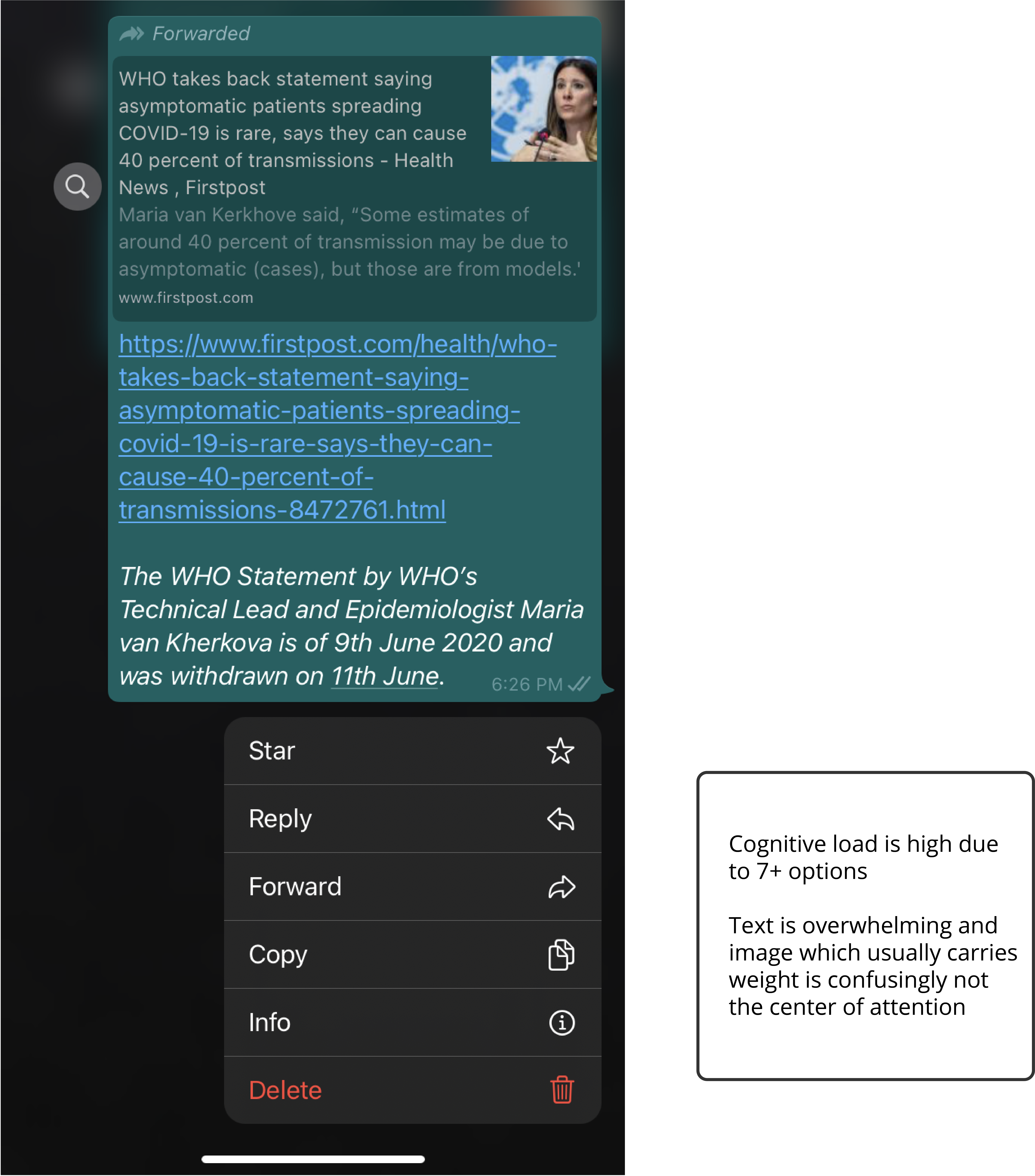
Information Hierarchy Classification
There are far too many options present in this screenshot and there is no clarity about what to look at first. This breaks multiple UX Laws the first one being that someone can only process up to 7 pieces of information at a time. The second law is that with increasing choices comes increasing complexity, leading to a discouraged user.
Focus
○ Increase accountability through feedback
○ Cater to altruism through user interactions
○ Decrease exposure to illusory bias
Re-Design
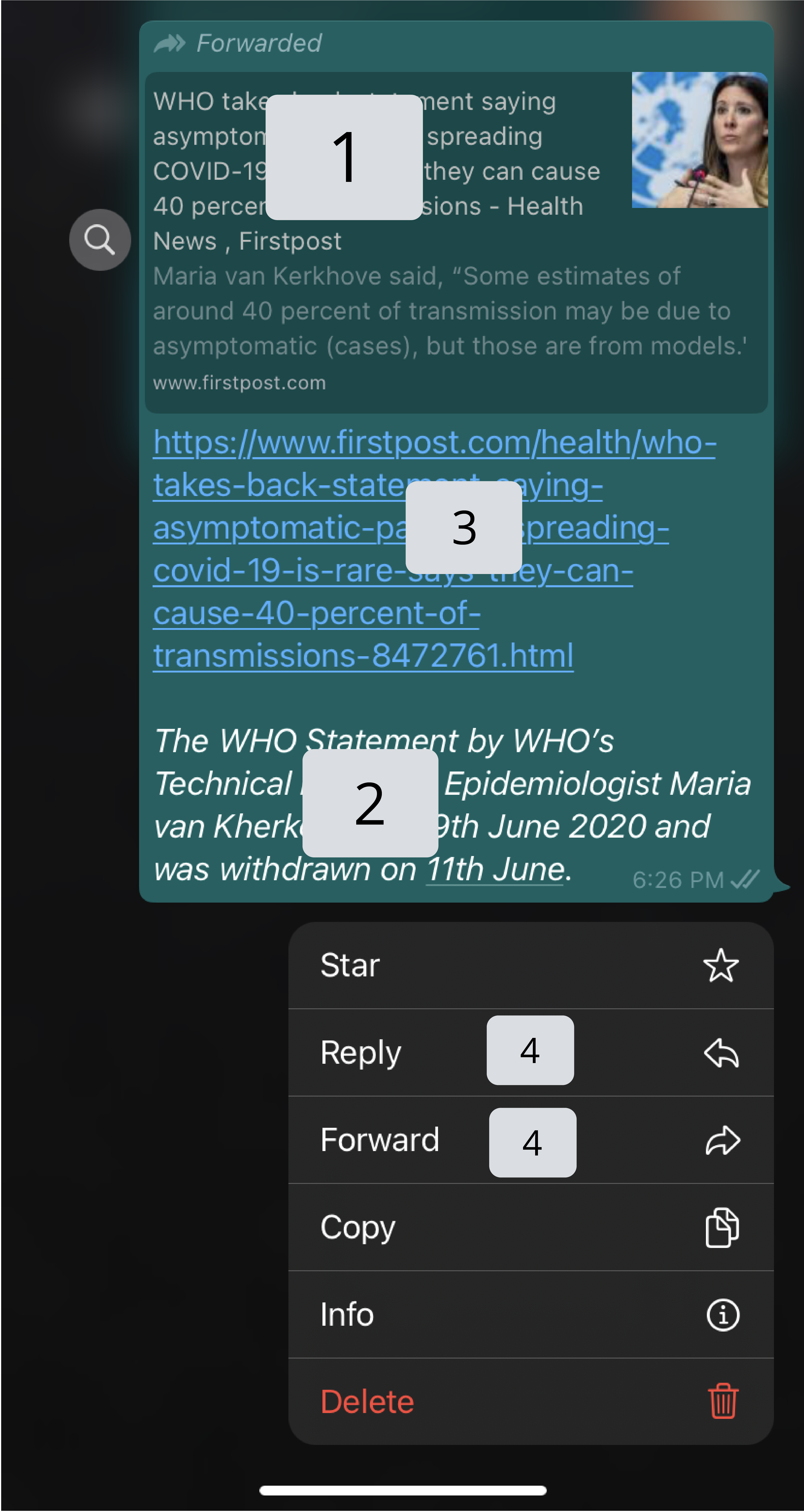
Functional Wireframe
.png)
.png)
.png)
.png)
The feature I added here works to give an extra barrier before forwarding unverified information and evokes accountability by situating the user as a part of something bigger. There is a human need to belong to a system (level 3 of Maslow's Hierarchy) and using that to drive reflection will give a break to the tendency to share excitatory information at the expense of others. At the very least I hypothesized that it would increase the time between seeing something and forwarding it.
In many psychological studies, giving authority to the tester often increased their morality and made them tell others the importance of following the rules. By putting the responsibility in the users hand, they feel that the system is theirs.
I also cleaned up the UX of the article card because a lot of the information was redundant and overwhelming. Based on the hierarchy I labeled prior, I added emphasis to elements.
Lastly, the reply and forward feature are used more than the other options so to reduce cognitive load I added in the progressive disclosure of options once holding down a text.
.png)
.png)
.png)