Project Overview
This is the story of how I designed my portfolio to be accessible, intuitive, and enjoyable to users while displaying my thought process for each case study.
Background
Portfolios are useful to gauge candidate work and offer a glimpse into a person's natural user experience and design priorities.
Problem
Case studies are dense and require high information exchange without an exhaustive cognitive load.
Goals
○ Reduce cognitive load through progressive disclosure
○ Optimize user navigation
○ Cue user to most crucial information
My Role
I compiled research on successful portfolios and ran a multi-variate regression. I used this for defining my information architecture to make a wireframe. I built out my site from scratch and conducted a first-click test. I continue to iterate based on feedback.
Tools
User research, Balsamiq, first-click testing, A/B Testing, Data analysis (IBM Watson), Data Visualization(R), HTML, CSS/SASS
Time-line
June 2020- Always Iterating
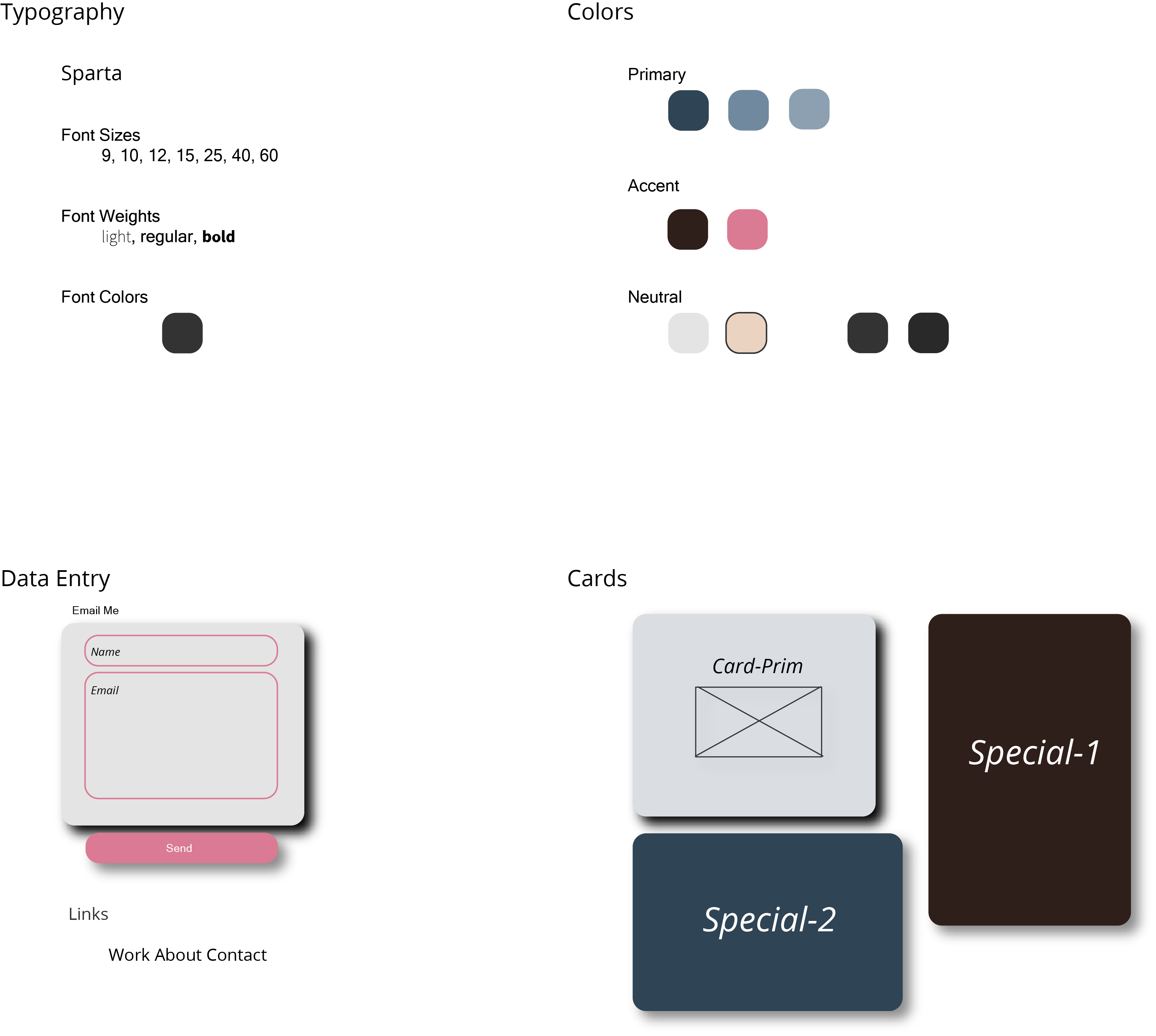
Primary Framework
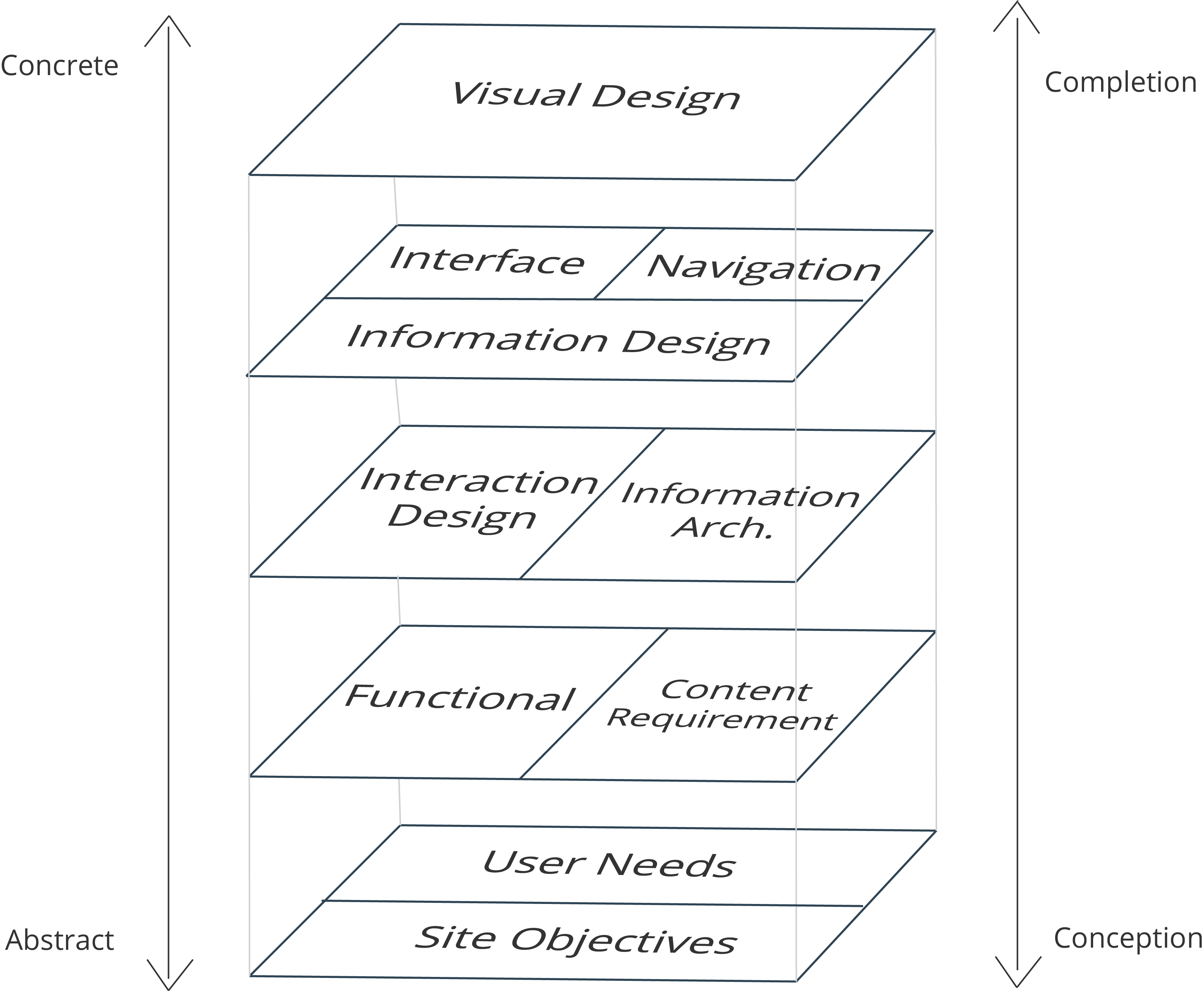
Contextual Inquiry
General Research
I read through various UX and HCI blogs to get an understanding of what current portfolios are meant to do along with common complaints. My sources included UXPlanet, Smashing Magazine, Medium, and the Neilson Norman Group. I noticed similar themes arising from all of them and began my informal data collection.
I organized all these points into a few subcategories but the overarching pain point was the tradeoff between functionality and usability. This was an interesting insight but I wanted to quantify it to apply to my website.
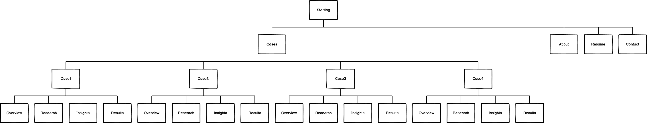
Site and User Needs
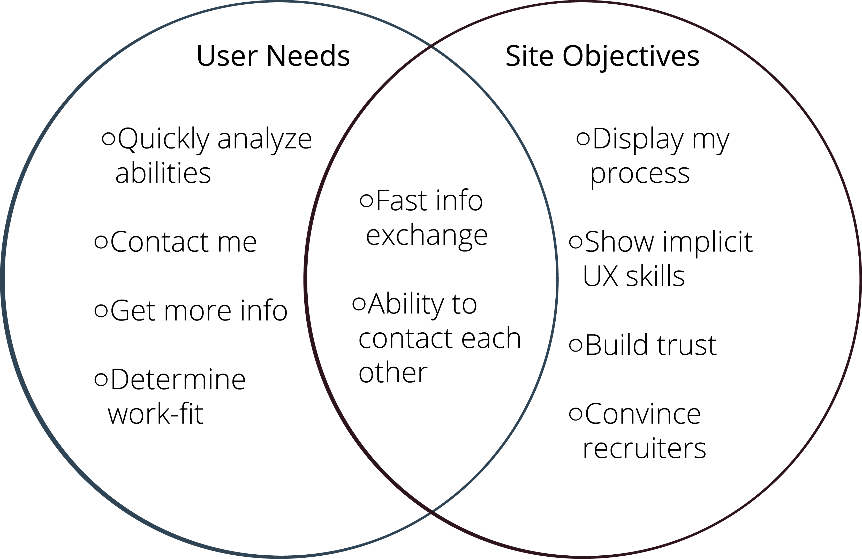
Before going further I defined my original view of what the portfolio would provide me and the user.
However, I wanted to validate some of these themes and visualize them so I ran an analysis on a previously conducted data set in R.
Data Analysis
Three Factor Regression
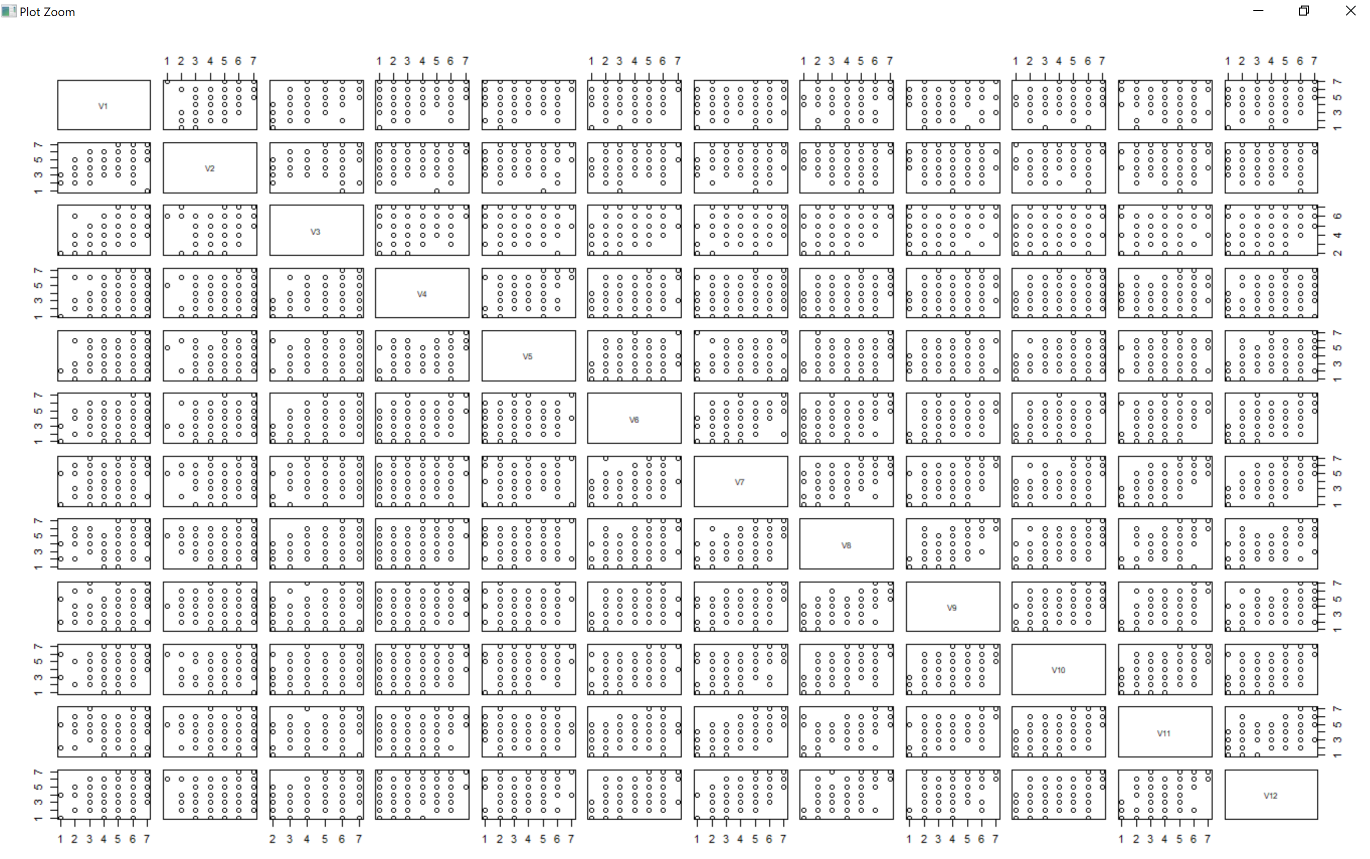
Through Google Data I found a factor analysis study on the impact of the flow of a website on cognitive enjoyment. They conducted a questionnaire following an online shopping experience and deduced that the answers could all fit into three primary categories: Attention, Control, and Cognitive Enjoyment. They provided the raw data for their study as 12 variables; 3 samples for Control, 4 samples for Attention, and 5 samples for Cognitive Enjoyment. I analyzed their data in the following steps in Rstudios.
Once I loaded in the data I wanted to check for any immediate warning signs of correlation amongst the variables. The pairs plot here shows that no two variables have positive or negative correlation which is crucial for a regression analysis. This was stated by the authors of the original study and I double-checked it.
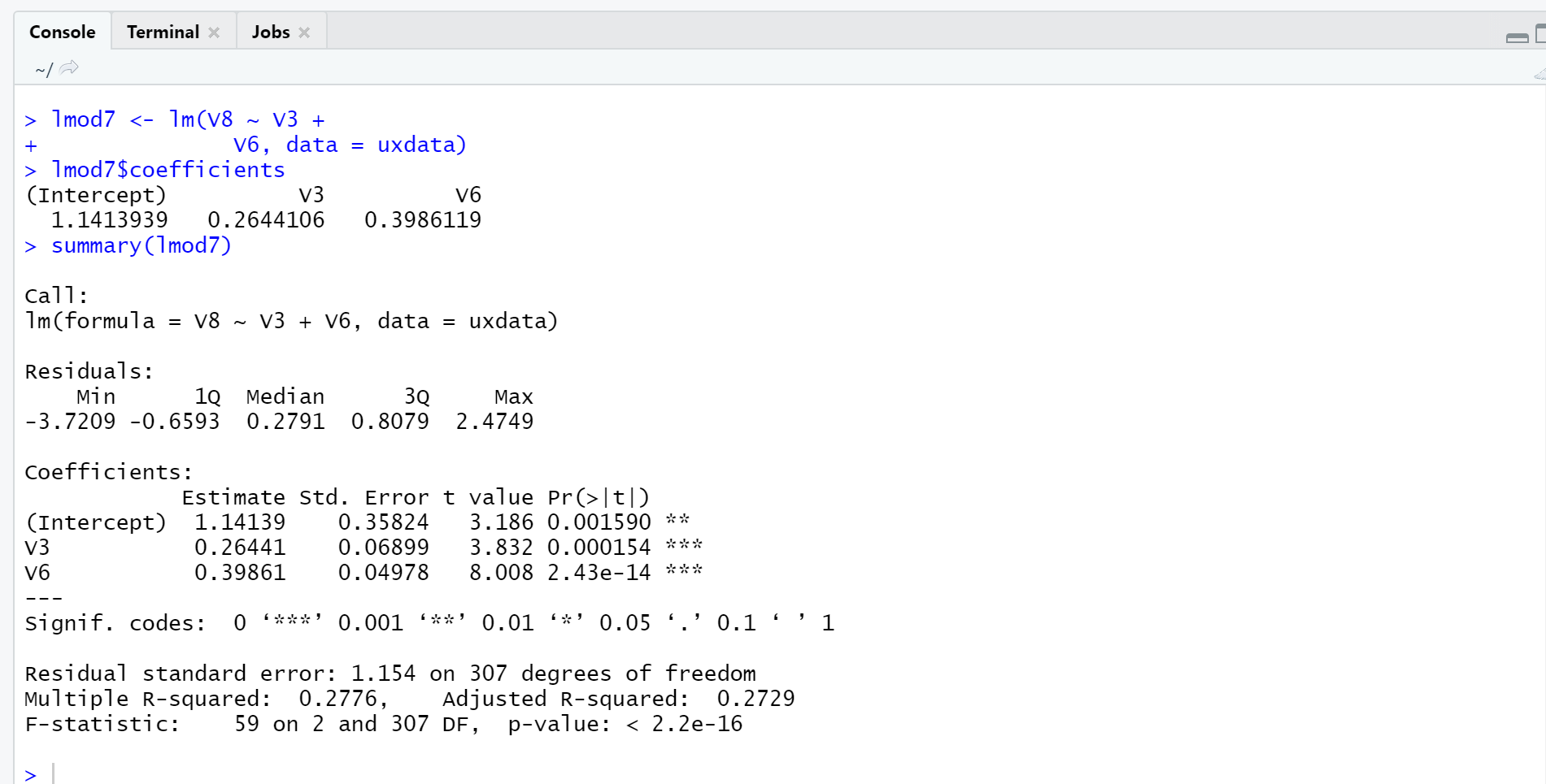
My goal was see which factor (attention or control) contributed more to cognitive enjoyment and at what rate. Since I had multiple samples of each variable I chose to regress a sample of Cognitive Enjoyment on A sample of Attention and a sample of Control until every possible combination was computed.
Based on the R-squared and t-values values for each regression, it was clear that Attention consistently contributed to Cognitive Enjoyment more than Control.
Since my goal was to get a quick and basic understanding of quantifying these user experience factors, I left the data analysis process here. If I wanted a more specific algorithm for exactly how much each factor contributed to Cognitive Enjoyment then I could have pursued optimizing R-squared and decreasing residual sums of squares and standard error to derive the beta coefficients. For the purpose of my portfolio, I chose to rather visualize these three factors on a three-dimensional scale.
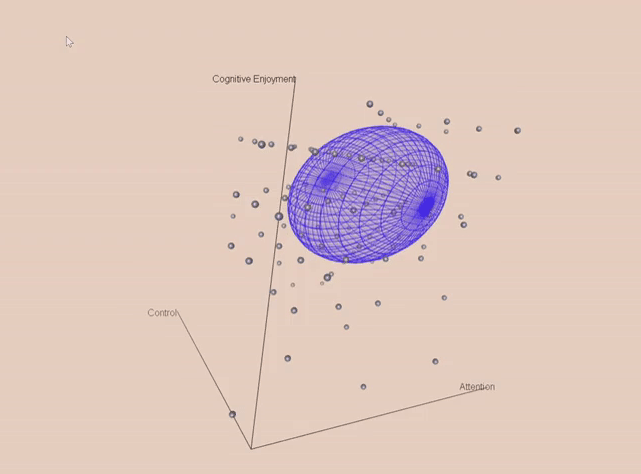
As expected, higher Attention and Control lead to higher Cognitive Enjoyment for the user.
.png)
.png)
.png)
.png)
.png)
.png)
.png)
.png)